
Team Lead

User Experience Researcher

User Interface Designer

Prototyper

Figma

FigJam

Goal-Directed Design

9 Weeks
Pihu, is a mobile skincare recommendation app prototype targeted towards young adults, with personalized results for your skin type. Pihu came about because current day social media is flooded with influencers and their sponsored skincare recommendations. With sponsored skincare, it is hard to know which product will work, and which product won't work.
For my Interaction Design I class, I was selected as a team leader after I pitched the idea of Pihu to my classmates. Enough people were interested in working on my idea that Pihu was able to be brought to life!
With a team of four, I lead my teammates through the creation of Pihu using Goal-Directed Design (GDD), this involved user research, usability testing, and developing wireframes that would eventually lead to the final project. As team leader, I was also responsible for communicating schedules, deadlines, reminders, and announcements.
My team and I followed the process of Goal-Directed Design (GDD) in the development of our prototype. GDD, developed by Alan Cooper, is a methodology that puts users at the center of the design process. Each stage of the design process focuses on the needs and goals of the user and then turns those goals into activities and then eventually a usable product. Our team followed the five stage process of GDD down below, starting with research.

Research is the first step of GDD and is an important process. Through research, we are able to better understand the users and the product we are creating. There are five phases of research, and we went through each of them in this order:
1. Kickoff Meeting - We completed a kickoff meeting worksheet to establish the basis of our app.
2. Literature Review - We reviewed literature about our app's domain to gain insights.
3. Competitive Audit - We looked for competitor apps and reviewed them.
4. Stakeholder (& SME Interviews) - We acted as stakeholders to set up app expectations and guidelines.
5. User Interviews - We interviewed five users to identify any behavior patterns between them.
Kickoff meetings are held to develop an understanding for the product and an opportunity for designers to ask initial key questions for the attending stakeholders. The answers to these questions not only give designers insight to the product but also an insight of how the stakeholders think about their product. This meeting will give clues on how to structure stakeholder and user interviews later in the process. Since this app was developed as a class project, there were no real stakeholders and clients, so for our kickoff meeting we filled out a kickoff meeting worksheet on FigJam, an online whiteboarding tool.
Taking on the role of stakeholders, here is what our team came up with:
The current state of the skincare market is focused on influencer and brand recommendations, with influencers and brands only recommending their products, giving few options for the various skin types.
Pihu will be targeted towards young adults, age 18-24, since they are still experiencing changes to their skin.
Our app will include a quiz for users to find out their skin type, and then product recommendations will be personalized towards their results.
To get more information on our product's domain, our team researched literature regarding the skincare market, consisting of trends, ingredients, and the online market:
First, we found out that possibly harmful skincare trends are on the rise due to influencers and popular online videos.
Next, we also found out that ingredients are an important part to skincare, different skin types and skin colors require differences.
Lastly, we also learned that COVID-19 has increased online shopping for skincare.
For a better sense of who we are competing against in this domain, our team researched for potential competitors and we reviewed them together. The competitors we found were, Curology, CeraVe, Skinsort, and Stylevana. We looked for the positives and negatives in each of them while thinking about how our app can stand out. Here are the things we focused on while reviewing each competitor:
Aesthetics
Forced email signups
Product details
Search and filtering options
Variety of products
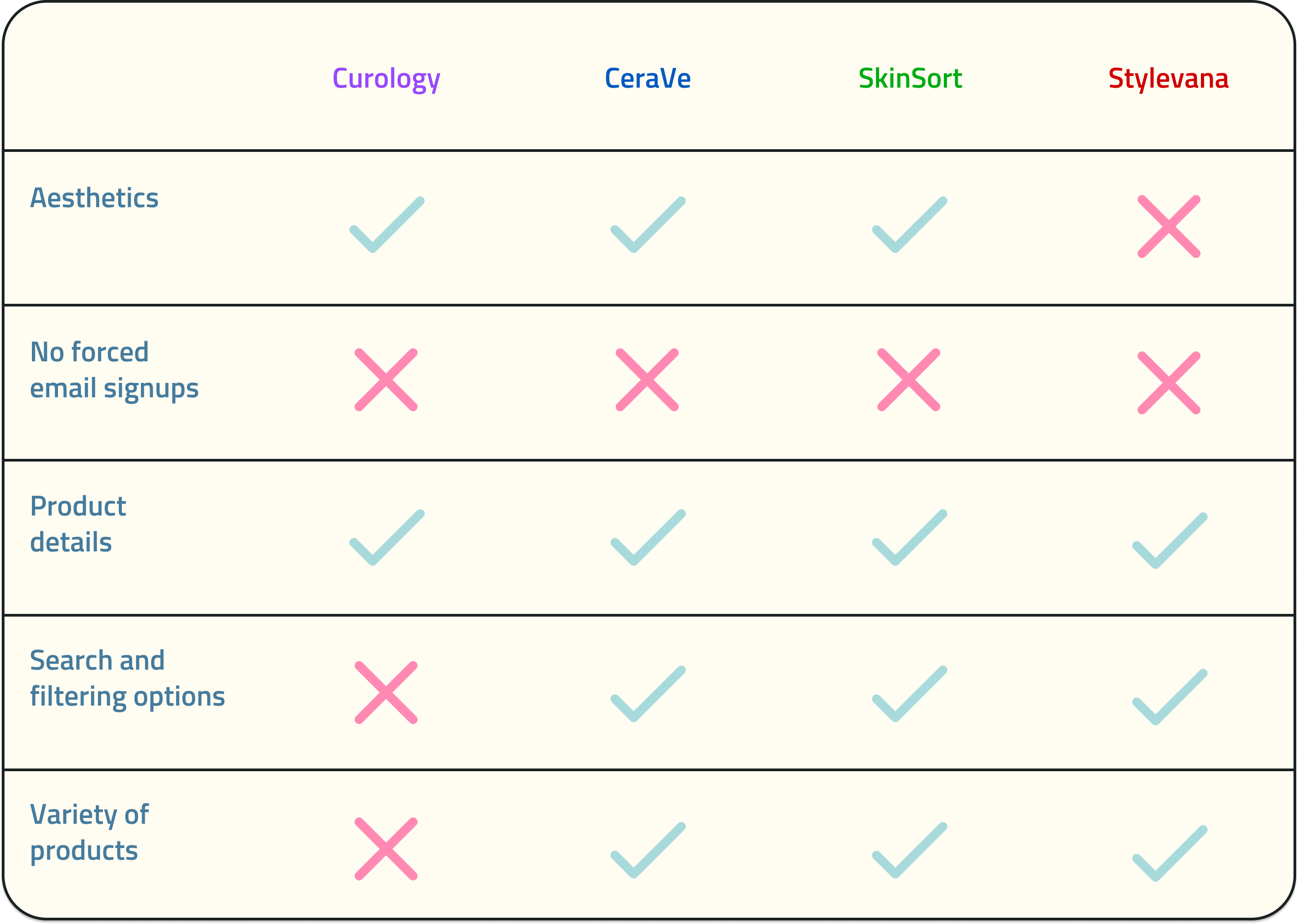
All of the competitors had an email sign-up popup before they could let users continue.
Product details were an important function for all of them
Search and filtering options were an important function to almost all of them
Three out of the four, (Curology, CeraVe, and SkinSort), had aesthetic looking sites, they all utilized the color blue.
Our main competitor was SkinSort, as Curology and CeraVe was focused on their brand, and Stylevana was an online market for skincare.
Stated before in the kickoff meeting, there were no stakeholders as this was a class project and a worksheet was completed instead. Stakeholder interviews typically allows the team to ask key questions regarding the product, such as, product vision, budget, constraints, opportunities, risks, and etc. Since there were no stakeholders, my team and I roleplayed as them and tried our best to hypothesis what they would expect from us and the product.
After completing the kickoff meeting worksheet, we created a persona hypothesis of potential users to interview for our app. From our persona hypothesis, we developed three possible user types, people who are curious, people who have troubled skin, and people who are beginners to skincare. Through these three user types, we determined that interviewees should have beginner to intermediate experience with skincare.
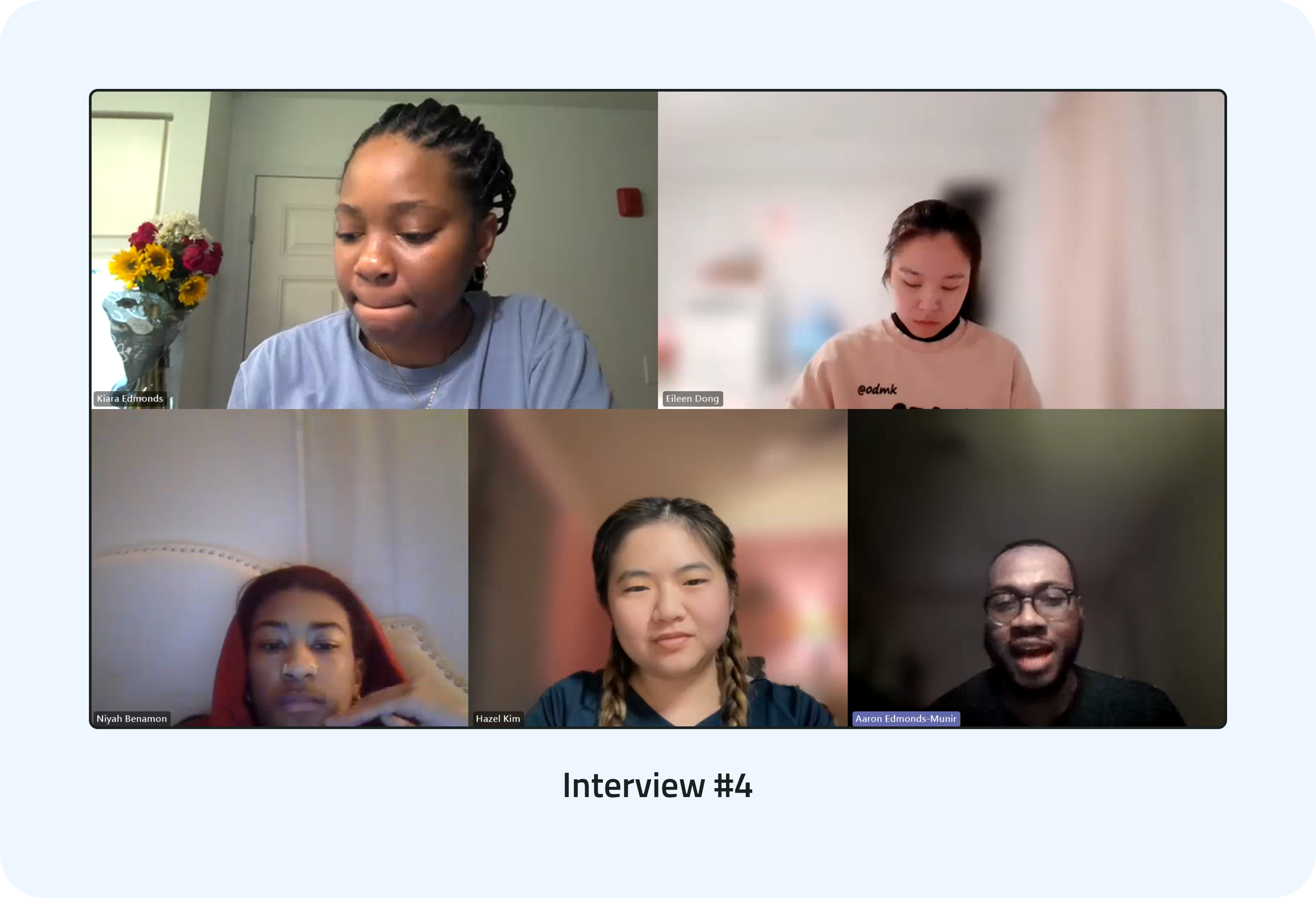
Our team members then reached out to friends and family to find possible interviewees, and we eventually found five people with different levels of experience with skincare. The interviews were all held online over a week and a half via Microsoft Teams (team collaboration application). During the interviews, we asked the interviewees questions regarding their journey with skincare, product experiences, and their shopping platforms.
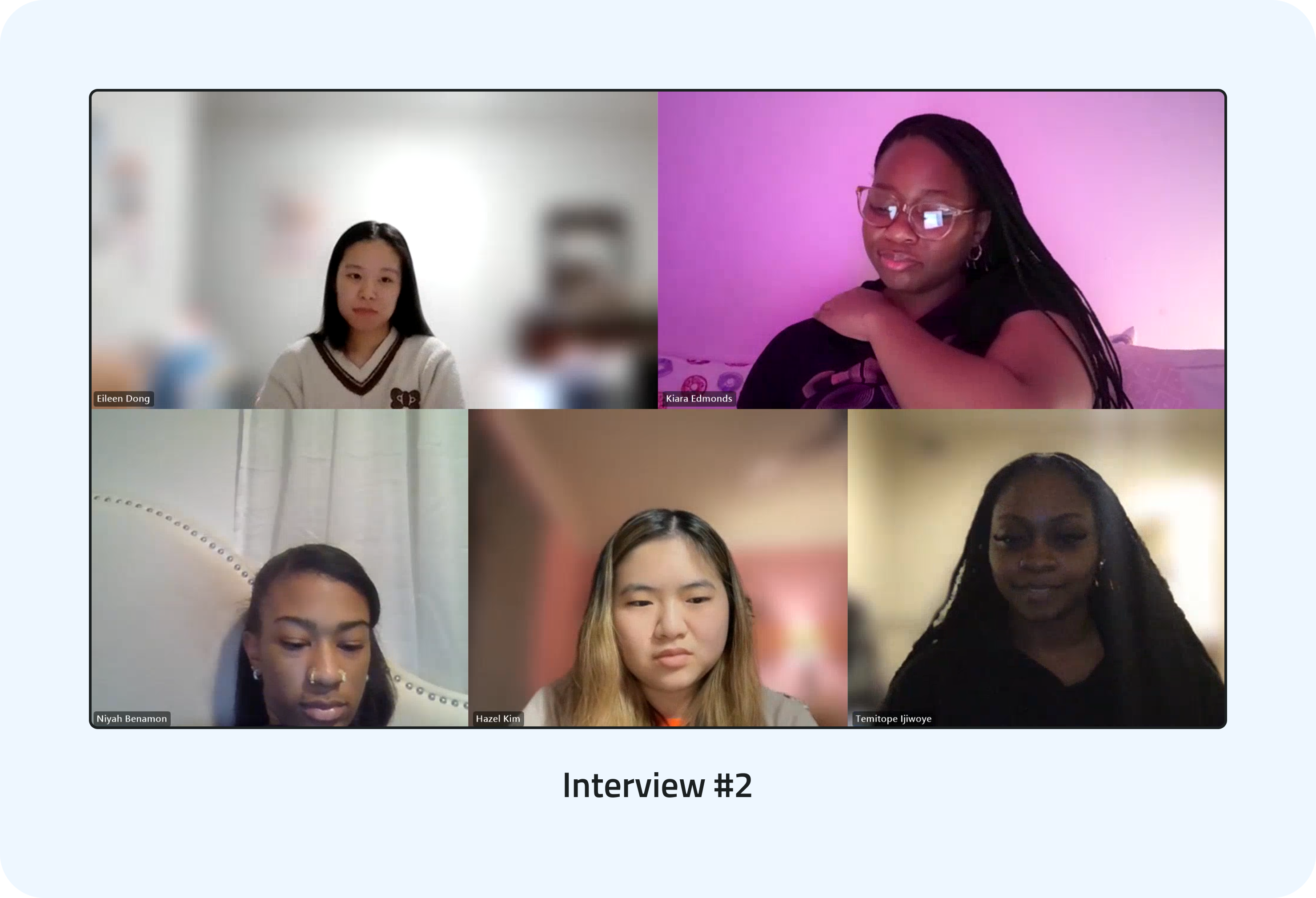
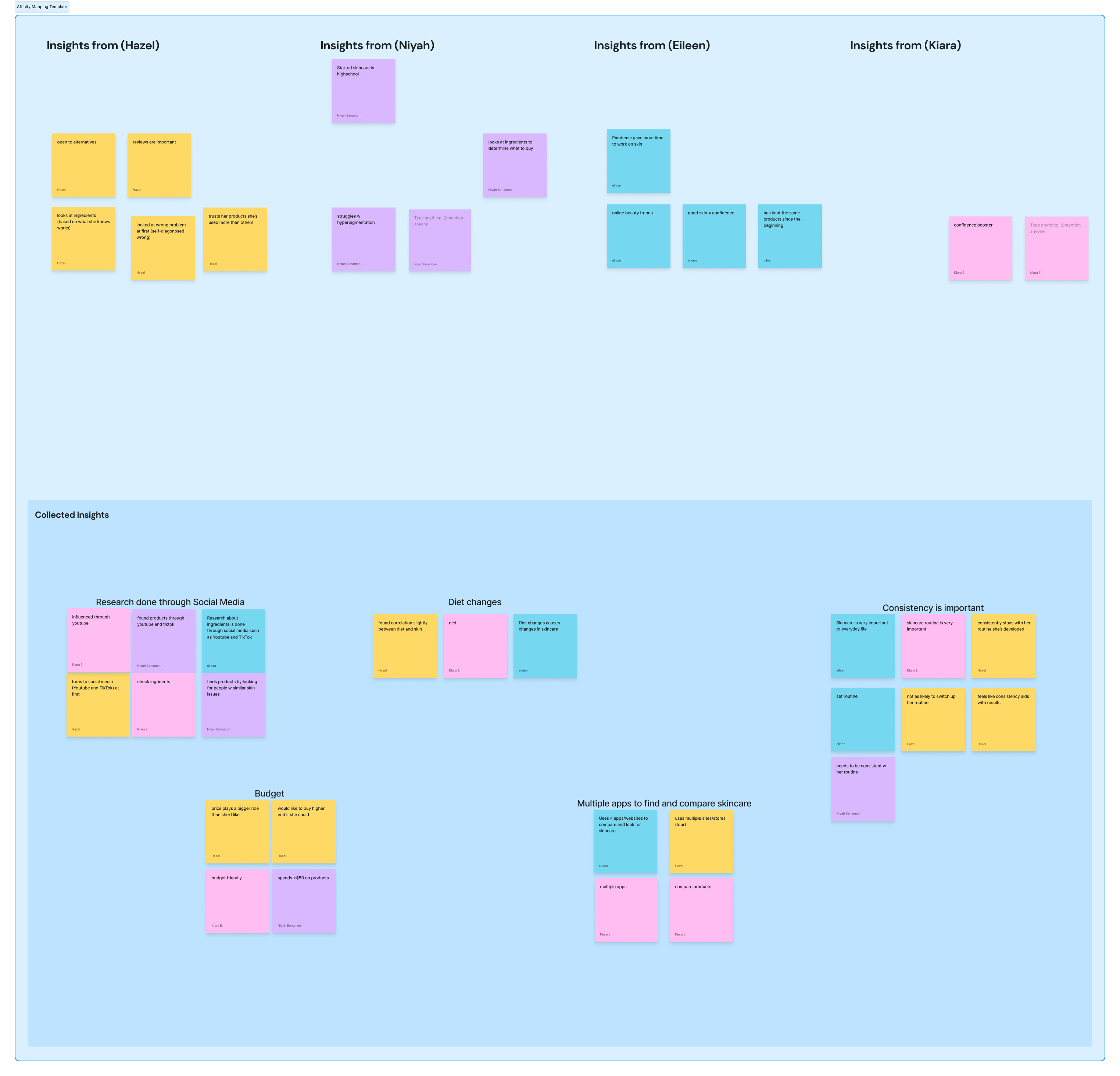
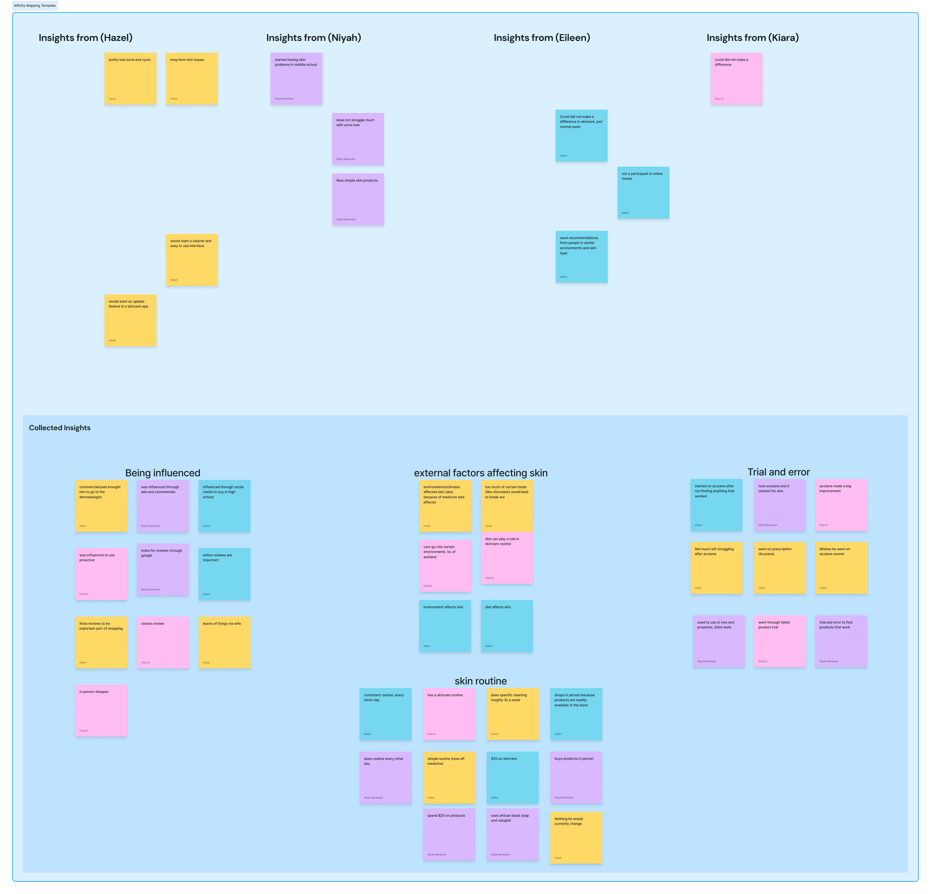
After each interview, we would move onto FigJam and start our affinity mapping. We would all take five minutes each to jot down important points, or any interesting information from the interview. Afterwards, we would regroup and try to find similarities between the notes we all jotted down, putting them into broader categories. Similar patterns would appear across all five of our interviews, with each affinity map having four to five groupings.
Affinity map from interview #2
Affinity map from interview #4
These are the groups that appeared the most between the five interviews:
Budget/affordability is an important factor when shopping for products.
All interviewees would do online research on skincare products before purchasing anything.
Consistency was an important factor in their skincare routine
These similarities that we identified will help us create our primary person in the next phase, the modeling phase.
To start the development of our primary persona, we gathered all the information from the previous research phase and identified fifteen behavior variables between all five interviewees. A primary persona is the main user of an experience. All of our variables were then treated as a scale, and we plotted our interviewees on each of the fifteen scales accordingly. Then, we would go through each scale and circle any behavioral patterns the interviewees were similar in. We ended up finding out that interviewees 1, 2, and 5 were very similar.
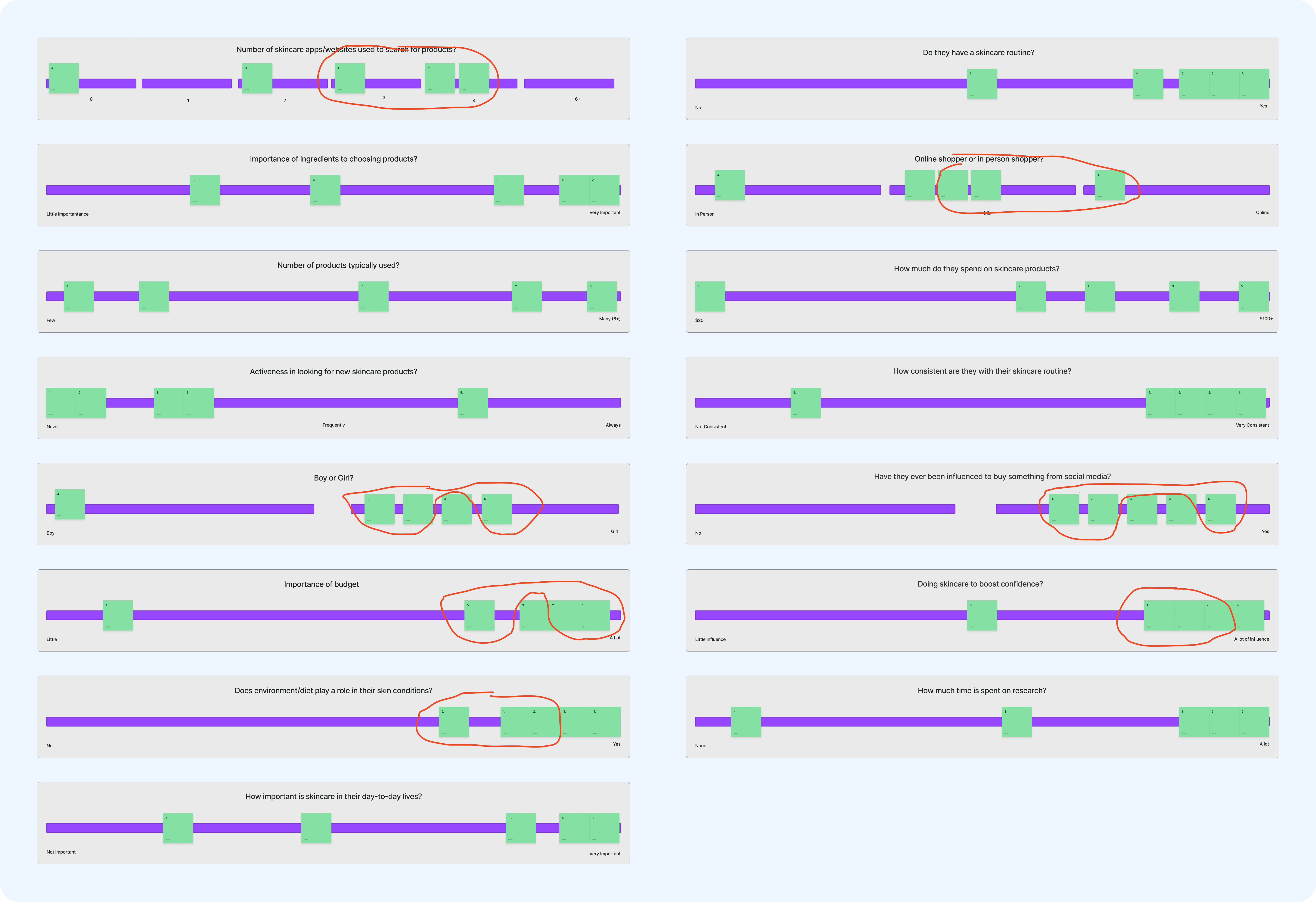
Behavior Variables Scales
Finishing up the groupings, we discovered only one main pattern, so we decided that Pihu would have only a primary user. This primary user is composed of interviewees 1,2, and 5, who have an interest in skincare and actively seek out new products to keep their skin glowing. With this in mind, we created three end goals (what the user wants to do) and one life goal (who the user wants to be) for our persona, and then to bring them alive, we gave them a name and a backstory.
Meet Silvia Simmons! Although only a single persona, Silvia represents the the common goals and needs of Pihu's users.
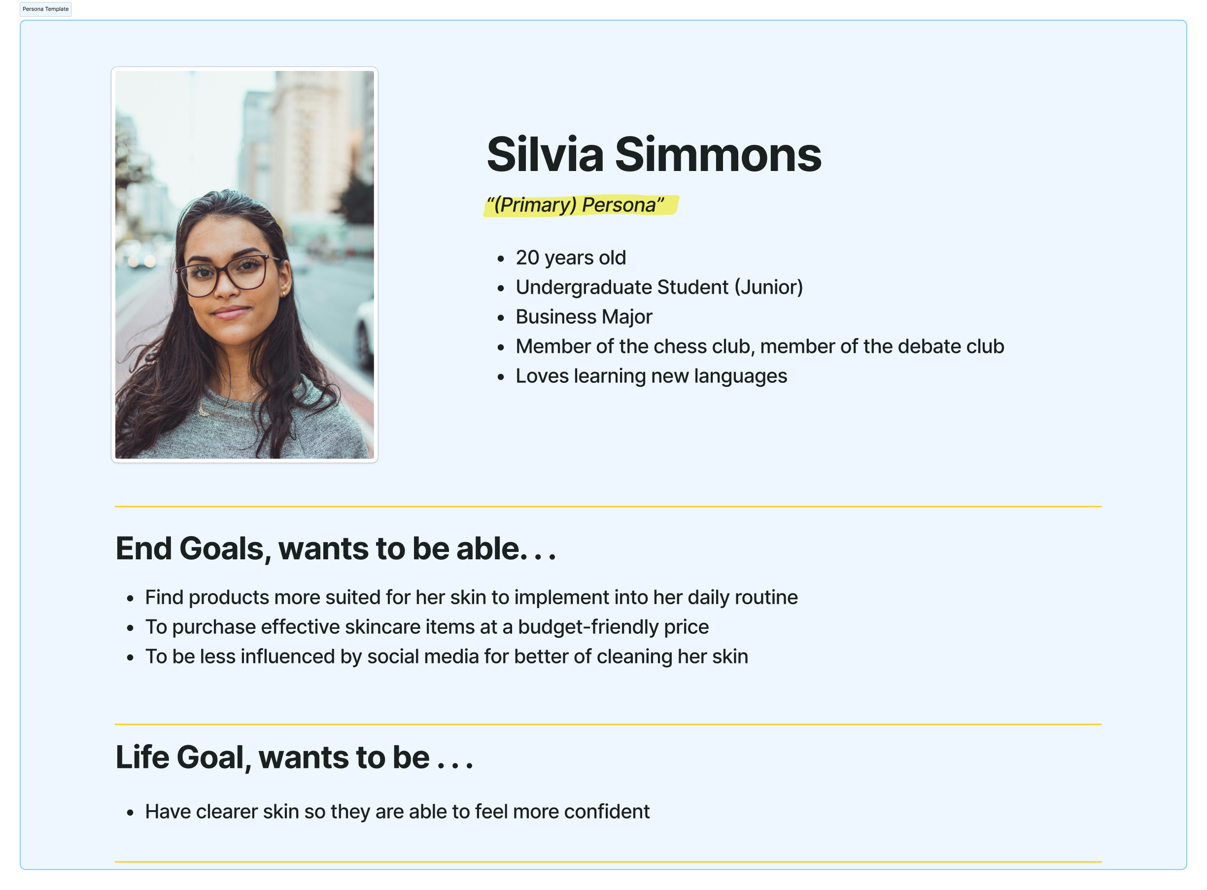
Silvia, our primary persona
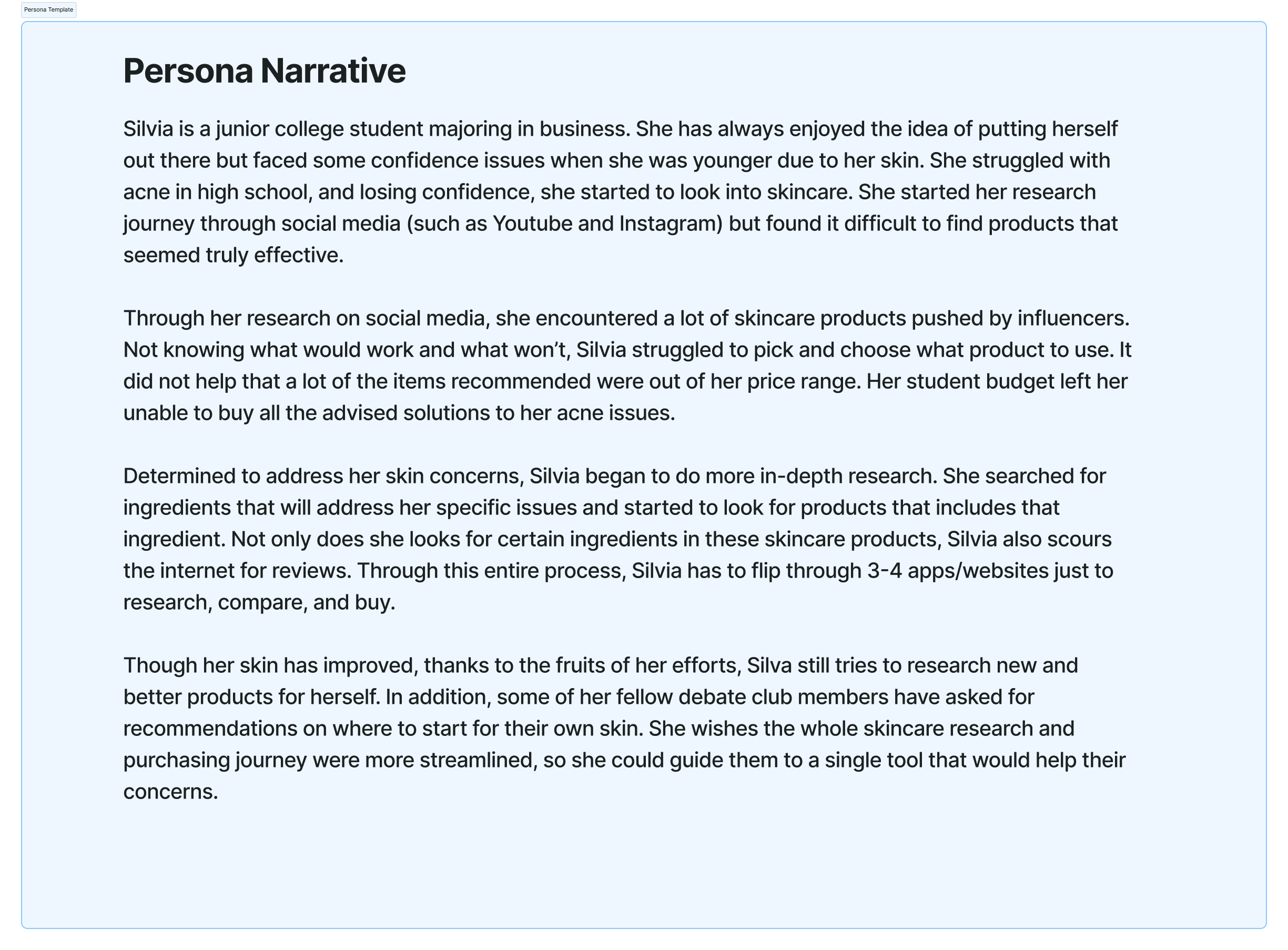
Silvia's narrative
With our primary persona established, the team then came together to create a context scenario for Silvia at a high-level. Context scenarios help us know how the app will fit into our persona's life and how it can help them achieve their goals. Context scenarios in GDD include the persona's various goals, motivations, needs, and how the persona will typically use the product. It will describe the persona's usage pattern in a broad context and include environmental and organizational considerations (Cooper, 113).
Once the context scenario was completed, we extracted a list of requirements from analyzing each sentence. From this, we were able to make out a requirements list, detailing user actions on certain objects and why those actions are performed. We then organized the list from highest to lowest priority, by doing so, we set up a foundation for our frameworks.
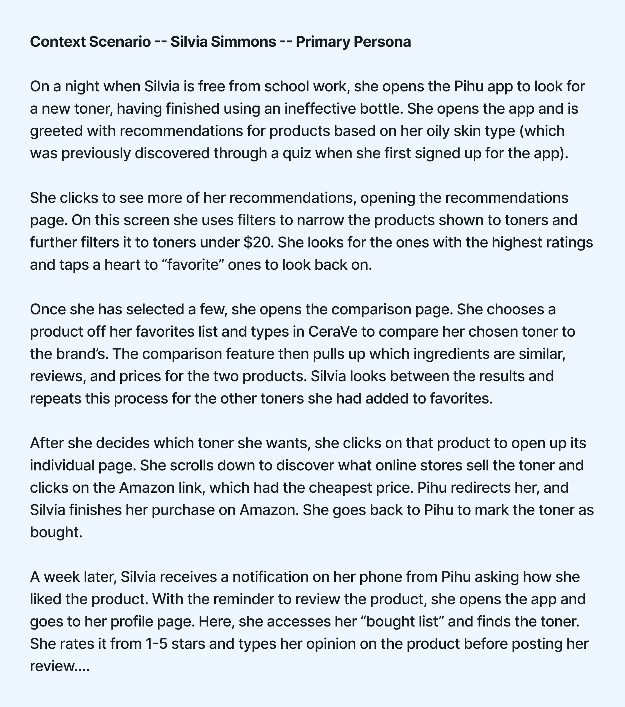
Silvia's context scenario
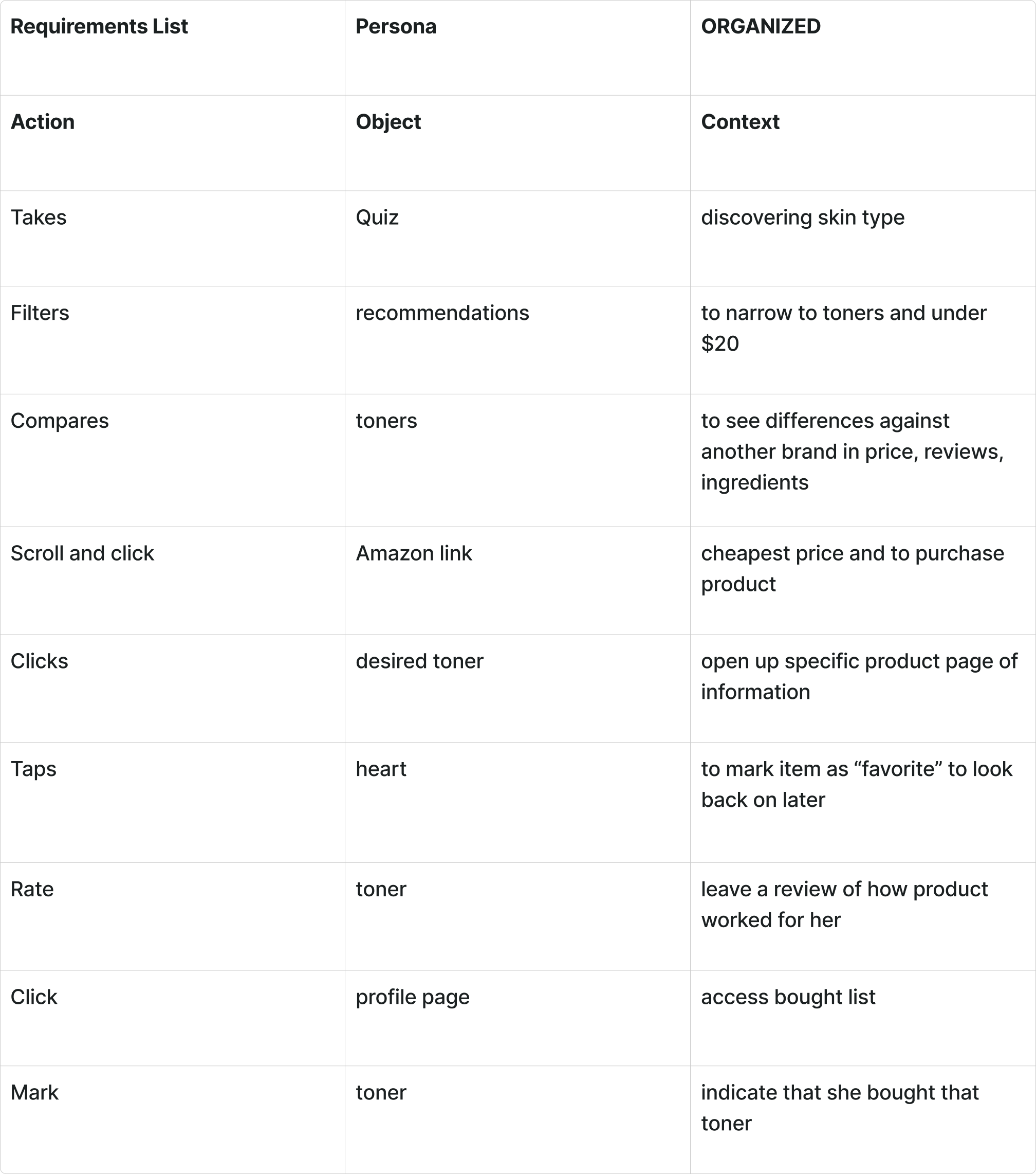
Requirements List
After going through all the phases beforehand, we finally arrive at the frameworks phase. With our requirements list established, our team moved onto FigJam, ready to start designing Pihu. We started by creating low-fidelity frames, using just simple rectangle frames and basic UI components.
Using our requirements list and context scenario, we mapped out two types of paths, key path scenarios, and validation scenarios. Key path scenarios (marked by blue arrows) are the main paths users are going to take on the app. Validation scenarios (marked by red arrows) are less common paths taken by users on the app. Together, these paths show how all the frames are linked together.
.png)
Low-Fidelity Wireframe for Pihu
Before starting, I gave my team our color palette along with the font family we are using in order to stay consistent across all the frames we are going to be creating. One of my team members kindly turned the colors and the font into styles on Figma (a collaborative web application for interface design), allowing the team easy access to them while designing.

Font Styles

Color Palette
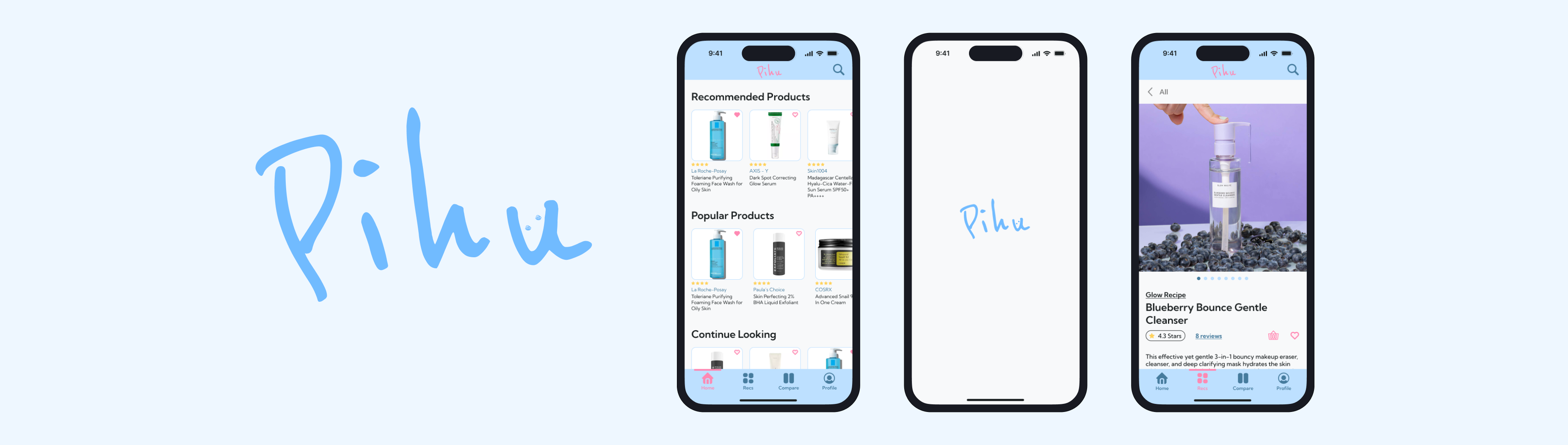
With our low-fidelity frames, font styles and color palette in hand, our team transitioned over to Figma to start designing Pihu. Our Figma file consisted of several pages to organize our design components, frames, styles, and abandoned elements. Throughout this process, we would regularly meet online over Microsoft Teams to ensure that everyone was on right track and everything in the design was consistent across all of our frames. The end result was 70+ frames, including overlays, all fully designed and linked together, giving you Pihu. The images below show you some of the screens from Pihu, along with our full prototype file inside of Figma.
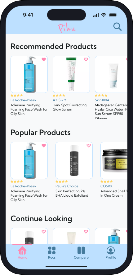
Pihu's Home Screen

Product Page
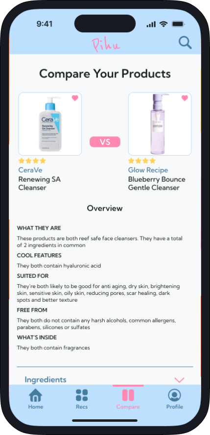
Comparison Page
Pihu's Full Prototype
After finishing up our prototype, our team moved onto the refinement phase. In this phase, we were tasked to find two users to perform usability testing. I found two participants, one of our previous interviewees, and the other an entirely new person. Both tests were conducted over Microsoft Teams where I led the testers through our prototype, asking them to complete certain tasks such as, leaving a review, finding the product pages, and going through the recommendation pages. While going through these tasks, we asked the testers' to express their thoughts about the prototype while noting when they struggled.
From the feedback we gathered, here are the adjustments we made:
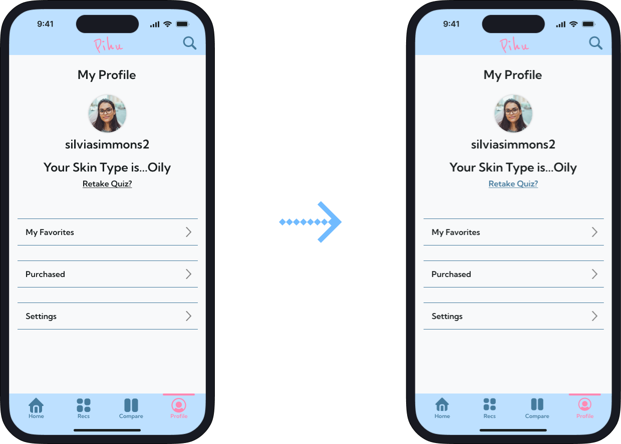
Profile Page: "Retake Quiz" button color is changed
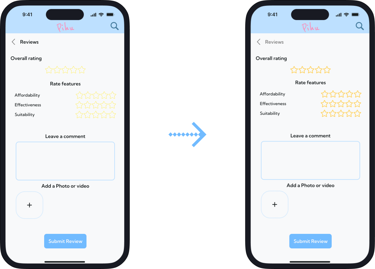
Review Screen: the color of the stars were darkened
Finally after a long process we have reached the end! At the end of this project, we were able to present the final prototype of Pihu to our class. Leading this project has been difficult but also a fun experience for me. My teammates, Hazel, Kiara, and Niyah have been the best, and I want to thank them for their hard work in bringing Pihu to life!
Being a team leader for such a large project I was initially nervous, but this has been a great experience and I can't wait to apply what I have learned to my future projects. Throughout this project, I tried my best to grow as a team leader, making the final decisions, making sure everything was set up properly, and making myself available.
One thing I wish we could've done better was the research phase of our project, but more specifically the user interviews. I wish we could've taken more time on the user interviews as they were all really short. Having longer interviews would've given us more information to work with as some of the questions weren't as detailed as I preferred and some of them were repeats of each other.
Another thing I would've done differently was to first sketch out the low-fidelity frames on paper before moving them onto FigJam. Sketching them out would've given me more freedom to design what they would like, and would've given my teammates a head start.